Tuesday, January 31, 2006
Planes, Trains and Plantains
This is without a doubt the most amusing English essay I have ever encountered.
Gmail and the paradox of organization
I've used Gmail since 7/9/05, when I bought an invite on eBay for a couple bucks. I'm just now downloading it all via Thunderbird, and the volume of information is absolutely staggering. In the 571 days I've had the free account, I've sent and received 17,037 emails, plus spam. As I was downloading it to Thunderbird, it occurred to me that Google products turn our traditional sense of organization on its head, and I'm not sure that's entirely a good thing.
On one hand, you've got traditional organization of information. Think of a public library, with floors and floors of stacks and stacks. All the books are carefully organized by topic, author, you name it. The same mindset used to work for organizing email. You put stuff in folders of various types. Some of them group messages by sender, some by subject, etc.
That's all out the window. Now you've got the benefits of organization -- rapid recall of information by referring to meaningful associations -- without the work. My inbox used to be an array of meticulously arranged folders, which required conscious effort to maintain. Now, it's as though I tore every page out of every book and tossed them all in a swimming pool. But when I'm looking for something, I can dive in and grab the right page, every time.
In making traditional organization quaint -- if not completely obsolete -- I wonder how we're fundamentally altering our thinking about organization. Does the benefit of organization come from having access to a set of well-sorted items? Or does it come from the act of sorting the items, making hundreds of subconscious connections as you go along?
I relate this to note-taking in college lectures. I always took pretty good notes, but I rarely went back and studied from them. I used the act of taking notes -- the act of organizing -- to straighten out my thoughts.
I would bet that if you rigged someone up with a machine to monitor brain activity, you'd see different areas light up when they're searching on Google than you would when they're looking for something in a library, and I bet the Google-stimulated areas would be related to social dealings and relationships.
Now if I can just get a grant...
Monday, January 30, 2006
'So please give me some tea...'
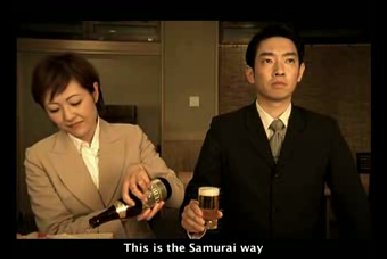
Lately I've been eating sushi a lot. I don't know what it is, but I can't get enough sushi.
 That's why I was so excited to find this video.
 That's why I was so excited to find this video.
Thursday, January 26, 2006
Pancakes and bizarre sexual deviancy
Late tonight I had a hankerin' for some tasty vittles, so I scooted on down to the local IHOP for a jalapeno omelet. The place was pretty empty: just me, a trucker, the waitress and the cook.
Then the transsexual hooker walked in, with a guy who I really hope knew what he was doing.
This wasn't one of those transsexuals where you look and say, "That might not be a woman." This was plain as day.
You see, I was blessed with an eye for subtle details that escape the notice of ordinary people. For example:
- She was about 6-foot-2.
- She was built like a brick shitter.
- She had a five o' clock shadow.
- And an Adam's apple.
Tuesday, January 24, 2006
Weight loss update: Normal at last
I weighed in today at 204 pounds, putting my Body Mass Index at 24.8, below the official threshold for "overweight." Now I'm normal. Kinda.
Accordingly, the "Matt's Fat Ass Update" box in the sidebar has been amended.
That's my cell phone number; hit me up on the low
I'm in the market for a new cell phone. I've been using an old phone since those wretched scumbags stole my new one, and I'm tired of it crapping out.
Any suggestions? Requirements are as follows, in descending order of importance:
- Compatibility with the Verizon CDMA netword
- Bright screen
- Good battery life
- Speakerphone
- Camera
- Color front screen
Memorial Eye Center and the five-hour burrito
Let me preface this with what I expect as a customer: I want a business to appreciate the value of my time and money. I want businesses to realize that they are competing with other businesses for that time and money.
Memorial Eye Center fails big time. I went in to order a pair of glasses. I picked out a pair, and told the woman that I'd like to buy them, filled with my prescription, which the store has on file. She spent a couple minutes filling out a form, then said "Oh, these will take a little longer." Apparently that frame requires the use of a machine that the store didn't have. Okay, fine. "How long?"
"About two weeks."
TWO WEEKS?! Are you freaking kidding me? Keep in mind that I can think of at least a half-dozen places where I could get glasses in AN HOUR. Let's say Memorial Eye Center is open 50 hours a week. That means that this East Berlin of an eyeglass store takes 100 times longer than its competitors to make the exact same product.
Here's an analogy. Let's say you like Taco Bell. You drive through Taco Bell once a week and buy a burrito. Average time for the transaction is, say, three minutes. Would you go to a competing taco joint and wait FIVE HOURS (3 min x 100) for the exact same burrito?
Yeah, me neither. Memorial Eye Center, you suck.
Monday, January 23, 2006
Just let your Soul Glo...
I was in the grocery store the other day, and I noticed a section of toiletry-type products marked "Ethnic HBC." I assume HBC means "hair and beauty care," or something like that. The products were all targeted at the beauty concerns of black folks, and they bore photographs of attractive black people.
Black guys tend to get razor bumps from shaving, so companies offer special lotions and shaving creams to combat that problem. Black folks tend to have coarse, kinky hair, which requires different care than the straight or curly hair generally found on people of other races.
That's all fine with me. We're all different, and we have different needs in beauty products. Look at soap: some people have oily skin, some have very dry skin, some are allergic to fragrances, some break out very easily. These are biological differences, and different products are available to address them.
My problem is with the use of the word "ethnic." Words mean things, and the grocery chain is stripping this word of its proper meaning. Everyone is ethnic. Here's how Merriam-Webster defines the word:
of or relating to large groups of people classed according to common racial, national, tribal, religious, linguistic, or cultural origin or backgroundAnd that's the second definition, which I think is more commonly used. The first definition is actually pretty insulting:
HEATHENSo, instead of using "Black Hair Care" or "African-American Beauty Products," the company opted instead to say something that could be interpreted as "Heathen Beauty Products" or "Uncivilized Hair Care." Yikes. Of course, the company wasn't trying to say that. It just refused to say "Black" or "African-American," probably to avoid appearing divisive or segregationist. Instead, it's stuck saying something which is meaningless at best, and horribly racist at worst. And yet, the company is inconsistent in its practice. The same store has a section, stocked with foods from Mexico. It's got Goya products, hot peppers, and even candles with Catholic saints on them. This section is labeled "Hispanic." I find it interesting that one ethnic minority can be marketed to explicitly and openly, while another ethnic minority is marketed to only by use of a code word.
Wednesday, January 18, 2006
Site lets you search for music by tapping rhythms
Arthur C. Clarke once wrote:
Any sufficiently advanced technology is indistinguishable from magic.Songtapper isn't quite there, but it's close. The site allows users to search for music by tapping the keyboard to the rhythm of the lyrics. I don't know how accurate it is overall, but it got "Rock You Like a Hurricane" right on the first try. [Hat-tip: Lifehacker]
Tuesday, January 17, 2006
Russell Alan Sartain, 1951-2006
 Russ Sartain died January 13, the victim of a hit-and-run accident in Galveston. He was buried today in the most heavily attended funeral I have ever witnessed.
He coached me in Little League for several years. I wouldn't say I knew him well, but the man who called me "Mattholomew" made a big, positive impact on my life. I was never a good baseball player; accordingly, I was usually relegated to right field. Regardless, when draft time came around every year, Coach Sartain skipped better players in order to keep me on the Zebras with my friends.
Coach Sartain was a master at balancing the seemingly contradictory tasks of a Little League coach: he instilled a desire to win, a dedication to fair play, development of his players, and fun. He was a fine example of the Little League Pledge:
Russ Sartain died January 13, the victim of a hit-and-run accident in Galveston. He was buried today in the most heavily attended funeral I have ever witnessed.
He coached me in Little League for several years. I wouldn't say I knew him well, but the man who called me "Mattholomew" made a big, positive impact on my life. I was never a good baseball player; accordingly, I was usually relegated to right field. Regardless, when draft time came around every year, Coach Sartain skipped better players in order to keep me on the Zebras with my friends.
Coach Sartain was a master at balancing the seemingly contradictory tasks of a Little League coach: he instilled a desire to win, a dedication to fair play, development of his players, and fun. He was a fine example of the Little League Pledge:
I trust in God I love my country And will respect its laws I will play fair And strive to win But win or lose I will always do my bestI don't remember many specific games, or big plays or end-of-the-season parties. What I remember is his words. I remember him writing "GF" on the roster after an absent player's name, signifying that the kid had "Gone Fishing." I remember him meeting my friend Lorne (who was named for Lorne Greene), then joking "I guess your folks were watching Bonanza that night." I remember that he always called the Astros (one of the better teams in our league) the "Half-Astros." Most of all, I remember his declaration that "a good excuse is still an excuse" and to this day I try to remind myself of that. Thanks, Coach. So let us commend our brother to the Lord, that the Lord may embrace him in peace, and raise up his body on the last day. Amen.
Sunday, January 15, 2006
In Soviet Russia, shots of Jager drink YOU!
Last night's audio from the Flying Saucer:
 The cast of characters in this little tragedy includes (in rough order of appearance):
Amy the bartendrix, waxing poetic about Harry Potter
Freddy, egging her on
Me, messing with Chris
Chris, threatening to kill me
The cast of characters in this little tragedy includes (in rough order of appearance):
Amy the bartendrix, waxing poetic about Harry Potter
Freddy, egging her on
Me, messing with Chris
Chris, threatening to kill me
Monday, January 09, 2006
AT&T gets new logo, still won't sell me a telegraph
Telecom giant AT&T recently revamped its logo, following its purchase by SBC. Trivial? Maybe at a glance, but the financial implications are enormous. Just think of the costs the company will have to incur: The old logo -- which was jealously protected -- consists of a blue circle made of latitudinal lines, on the upper left portion of which is projected a round, glowing spot. Both a solid (shown above) and a gradient version were produced. The gradient version is pretty much the same, only it has various shades of blue, which offer a more spherical feel. Below this symbol is "AT&T." Let's take a look at the portions of the old logo and what they represent:
 Here's my take on the new logo, bit by bit
An extensive re-branding initiative will occur over several months, with changes planned for the following:We're talking a long-term change, costing millions upon millions of dollars. You can't just roll into Earl Scheib and get 50,000 trucks painted overnight. So it's a big deal. Time for some critical analysis. Here's the design that used to grace Ma Bell's shingle:
- Nearly 50,000 company vehicles.
- More than 6,000 company buildings
- Roughly 40,000 uniforms and hardhats worn by company service representatives.
- More than 30 million monthly customer bills.
- Millions of business cards, customer information pamphlets, and phone and online directories.
- Company Web sites.
 The old logo -- which was jealously protected -- consists of a blue circle made of latitudinal lines, on the upper left portion of which is projected a round, glowing spot. Both a solid (shown above) and a gradient version were produced. The gradient version is pretty much the same, only it has various shades of blue, which offer a more spherical feel. Below this symbol is "AT&T." Let's take a look at the portions of the old logo and what they represent:
- Blue circle: The Earth. It may be American Telephone and Telegraph, but it reaches across the globe.
- Latitudinal lines: Connote the global and communicative nature of the company, while visually turning a circle into a sphere.
- Glowing spot: Located in the northern and western hemispheres of this logo, the glowing spot represents the enlightened modernity (thanks to Ma Bell) distinctive of the American telecommunications system. It's the A in AT&T.
- "AT&T": Printed in a bold, don't-fuck-with-us, monopolistic typeface.
 Here's my take on the new logo, bit by bit
- Blue and white circle: Still the earth, though the weather appears to be significantly cloudier than it was in the '80s, and the planet is much more translucent. Possibly meant to evoke ideas of the transparency and openness that global communications can bring. Or maybe not.
- Latitudinal lines, with see-through effect: Same idea as the old logo, but intended for a more pronounced 3-D effect. It comes off looking like a beach ball.
- Glowing spot: Much less pronounced, and reversed in color. Here, the latitudinal blue lines swell. The placement is still in the northern and western hemisphere, though that's more subtle now, since the top of the globe has been rotated towards the viewer and to the left a few degrees. Again, it's an effort to emphasize the three-dimensional nature of the design. I'm not sure why; that whole round-earth thing was settled a while back. Or maybe not.
- Lowercase letters: The boldface is gone, and the letters are kinder and gentler. A sort of cutesy aw-shucks, we're-still-here false modesty. Crap. An $80 billion corporation has no business acting like a teenaged girl named Staci who dots the I with a heart.
Sunday, January 08, 2006
Oh baby, dance with me
I've got "Everybody Have Fun Tonight" stuck in my head. Seriously stuck. It's been in there for two days now. If it doesn't go away, I'll have to dig it out with a fork.
Oh everybody have fun tonight Everybody have fun tonight Everybody wang chung tonight Everybody have fun tonight Everybody wang chung tonight Everybody have funDamn, it's catchy.
Subscribe to:
Posts (Atom)