Telecom giant AT&T recently revamped its logo, following its purchase by SBC. Trivial? Maybe at a glance, but the financial implications are enormous. Just think of the
costs the company will have to incur:
An extensive re-branding initiative will occur over several months, with changes planned for the following:
- Nearly 50,000 company vehicles.
- More than 6,000 company buildings
- Roughly 40,000 uniforms and hardhats worn by company service representatives.
- More than 30 million monthly customer bills.
- Millions of business cards, customer information pamphlets, and phone and online directories.
- Company Web sites.
We're talking a long-term change, costing millions upon millions of dollars. You can't just roll into
Earl Scheib and get 50,000 trucks painted overnight. So it's a big deal.
Time for some critical analysis. Here's the design that used to grace Ma Bell's shingle:
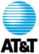
The old logo -- which was
jealously protected -- consists of a blue circle made of latitudinal lines, on the upper left portion of which is projected a round, glowing spot. Both a solid (shown above) and a gradient version were produced. The gradient version is pretty much the same, only it has various shades of blue, which offer a more spherical feel. Below this symbol is "AT&T." Let's take a look at the portions of the old logo and what they represent:
- Blue circle: The Earth. It may be American Telephone and Telegraph, but it reaches across the globe.
- Latitudinal lines: Connote the global and communicative nature of the company, while visually turning a circle into a sphere.
- Glowing spot: Located in the northern and western hemispheres of this logo, the glowing spot represents the enlightened modernity (thanks to Ma Bell) distinctive of the American telecommunications system. It's the A in AT&T.
- "AT&T": Printed in a bold, don't-fuck-with-us, monopolistic typeface.
I always liked this logo. It was simple, with only two colors (three, if you count the white). It was instantly recognizable even without the text, like the
Chevrolet bow tie, the
Nike swoosh, or the
Apple apple. And it kinda looked like a baby blue
Death Star.
Now, the new design, created by
Interbrand:
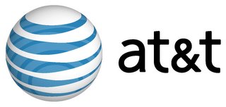
Here's my take on the new logo, bit by bit
- Blue and white circle: Still the earth, though the weather appears to be significantly cloudier than it was in the '80s, and the planet is much more translucent. Possibly meant to evoke ideas of the transparency and openness that global communications can bring. Or maybe not.
- Latitudinal lines, with see-through effect: Same idea as the old logo, but intended for a more pronounced 3-D effect. It comes off looking like a beach ball.
- Glowing spot: Much less pronounced, and reversed in color. Here, the latitudinal blue lines swell. The placement is still in the northern and western hemisphere, though that's more subtle now, since the top of the globe has been rotated towards the viewer and to the left a few degrees. Again, it's an effort to emphasize the three-dimensional nature of the design. I'm not sure why; that whole round-earth thing was settled a while back. Or maybe not.
- Lowercase letters: The boldface is gone, and the letters are kinder and gentler. A sort of cutesy aw-shucks, we're-still-here false modesty. Crap. An $80 billion corporation has no business acting like a teenaged girl named Staci who dots the I with a heart.
As you can probably tell, I'm not a big fan of this one. I don't think there's any major strategic screw-up on AT&T's part; I just don't find the new logo aesthetically pleasing. That said, AT&T did a number of things right with this rebranding, and the company should be applauded.
First, the company stayed true to its roots by refusing to rename itself. It's still AT&T, just like it's been since the earth cooled. The company was formed by the union of two firms with refreshingly boring names: SBC Communications (formerly Southwestern Bell), and AT&T (formerly American Telephone and Telegraph Company). The brass could've made up a name by splicing real words, like American Express did when it
spun off its brokerage as "Ameriprise." Or, it could've come up with a stupid name that focus-grouped well, despite being completely devoid of meaning.
Altria and
Enron come to mind. And in the phone business, we've got
Verizon. Select a prescription drug at random for another meaningless name. Kudos to the AT&T board, for dancing with the guy that brung 'em.
Second, the changes in the logo are evolutionary, not revolutionary. The overall design is pretty much the same; it's just been tweaked a little to bring it up to date. The change is similar to Apple
shedding its rainbow in or NBC's
peacock refits, Small, incremental modifications connote stability, something consumers like to see in what is really a utility company, and those changes have been apparent during the history of Bell/SBC/AT&T, something the company
points out.
Third, the logo's three-dimensional design allows for a greater range of motion than the old, flatter mark. I saw a commercial where the ball spun 90 degrees or so, bringing the bolder blue portion across, and it looked nice. One geeky beef: in the commercial, the logo rotated clockwise (from a north pole vantage point). The real world spins
counterclockwise. Was this a subtle message that AT&T is company that's unafraid to go against the grain? Maybe. But probably some animator just nodded off in his astrophysics lectures.
Fourth, the
new vans look really cool.
Here's AT&T's official corporate stuff about
the merger in general, and about the logo's
unveiling. And of course,
other bloggers have a lot to say.
 The old logo -- which was jealously protected -- consists of a blue circle made of latitudinal lines, on the upper left portion of which is projected a round, glowing spot. Both a solid (shown above) and a gradient version were produced. The gradient version is pretty much the same, only it has various shades of blue, which offer a more spherical feel. Below this symbol is "AT&T." Let's take a look at the portions of the old logo and what they represent:
 Here's my take on the new logo, bit by bit
5 comments:
Hey, what did they pay to have that done?
A high school fish graphics could student do it better!
the ball gives me vertigo, i hope i
don't get all dizzy when driving down
the road and see one of the company
vehicles.
must be the same marketing people that
said to change the coke recipe
What is it that prompted THAT much thought on this subject? Don't you have something to say about the Alito questioning or the coal miners? Of all things, why pick the AT&T logo? And, by the way, you should be quite proud of me (and yourself) for reading all the way through it. And for the record, every one of the different Windows logos ever for Microsoft have been horrible.
I've just always been interested in design, so I thought I'd expound a bit.
But hey, if you want my Official Positions on the Key Issues of the Day, I'm happy to oblige.
My Official Position on the Alito hearings: A gentleman should not make a lady cry.
My Official Position on coal-mine collapses: I'm against them.
Analysis couldn't have been better.
Post a Comment